
The Absolute Beginner’s Guide to Designing Glowforge Files Using Adobe Illustrator

So you want to make your own Glowforge files? That’s amazing!
There’s something so magical about imagining a new product and actually having the knowledge and technology at hand to make it come to life.
But getting started can be a bit intimidating, especially if you don’t have a background in graphic design.
The truth is that there are only a few things you need to know to get started designing Glowforge files using Adobe Illustrator (grab a free trial here).
FREE file design webinar:
4 Things to Know Before Designing Your First Glowforge File
1. Use strokes for cuts and scores.
Cuts go all the way through your material, while scores are thin engraved lines.
Stroke width does not matter for the Glowforge. You don’t have (much) control over how thick your score line is, so if you want something wider, use an engrave instead (see point 2 below).
To tell the Glowforge to cut or score, make sure there is a stroke color selected, but an empty (NOT white) fill. You can tell the difference by the red line used to mark an empty selection.
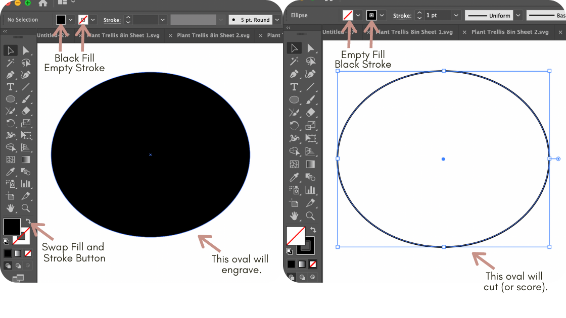
2. Use fills for engraves.
Set a fill color to tell the Glowforge where to engrave. Make sure your stroke is empty if you want to only engrave an area.
To both engrave and cut out a shape, set a fill AND a stroke color.
3. Make each step a different color.
Let’s say you’re making a file that includes cut lines, score lines, and two different depths of engraving. To let the Glowforge know that your scores shouldn’t be cut, and engrave 2 should be lighter than engrave 1, simply make them different colors.
The Glowforge will ‘read’ different colors as different steps. In fact, if you want to get technical about it, you can even choose colors in a particular order to have the Glowforge automatically place the steps in order, but I don’t bother with this since re-ordering steps in the Glowforge user interface is so easy (just click and drag them).

4. Convert your text to outlines and unite the letters.
The Glowforge can’t read text, so you have to convert the text into strokes or fills so that it will know what to do. Select the text, right click, and select Create Outlines.
Then, especially if you’re using a script font, you need to use the Pathfinder panel to unite your letters.
Script fonts include a little overlap between letters so that words don’t look disjointed.
If you don’t unite the letters, those overlaps will either cut out too (so you’ll have tiny pieces and not a smooth, attached word) or will not engrave (overlapping engraves in the same step will cancel out).

5. Save as an SVG.
It’s important to use Save As rather than Export or Save, and select SVG 1.0. It’s also important to turn OFF Responsiveness (uncheck the box) so that your file stays the same size when it’s uploaded to the Glowforge User Interface.
Is there a lot more you can do with Illustrator? Of course! But these basics are all you need to get started designing your own files.
Ready to dive deeper into file design? Grab your spot in my free webinar, 4 Things to Know Before Designing Your First Glowforge File now!
